
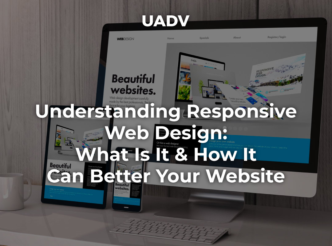
What is responsive web design? Well, in a nutshell, responsive web design is a way to create websites that look great on any device - from desktop computers to smartphones and tablets. It's becoming more and more important as people increasingly use their mobile devices to browse the internet.
This blog post will explain what responsive web design is, some of the best practices for creating responsive designs, and some key features you should look for in a responsive website. We'll also discuss the benefits of responsive design and give examples of how it can be used effectively.
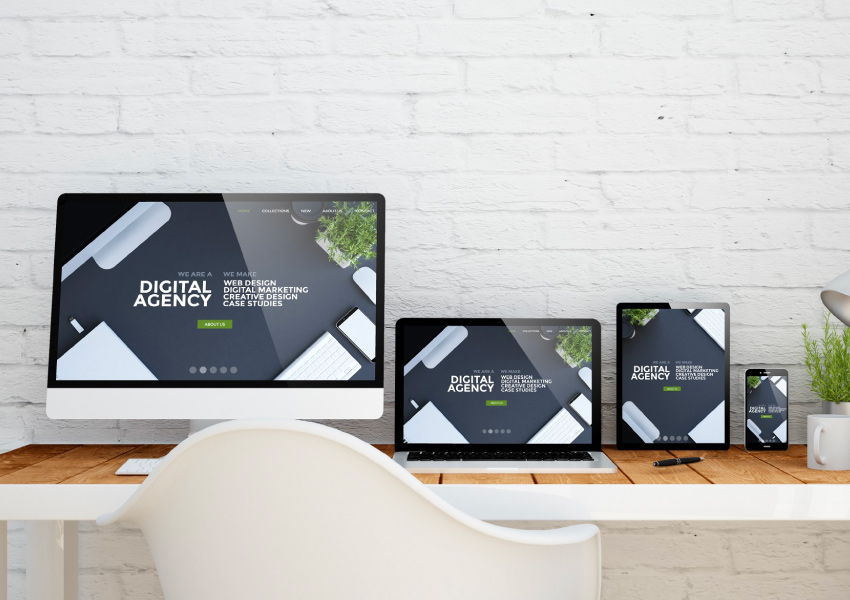
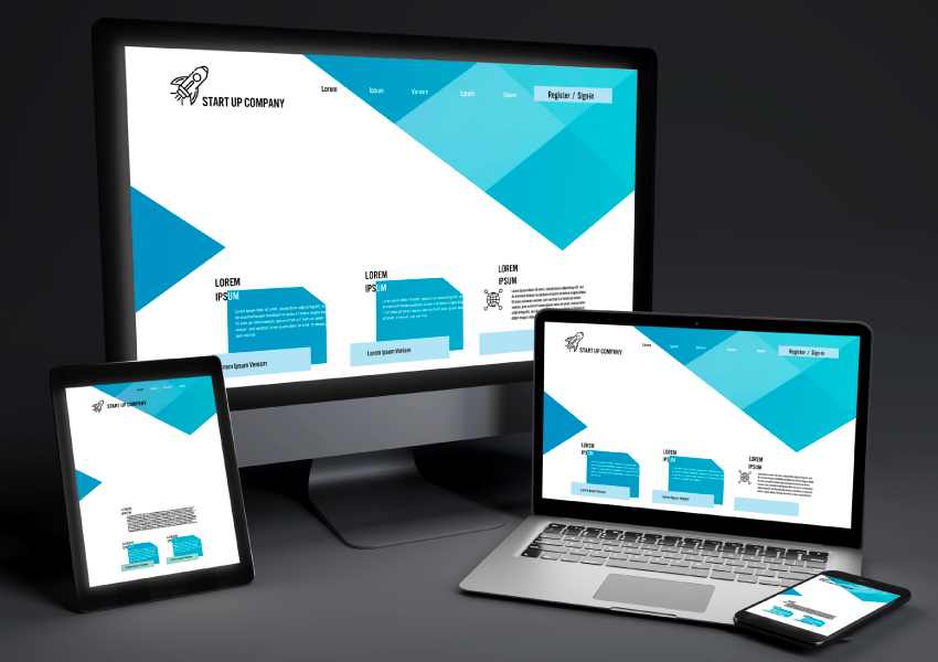
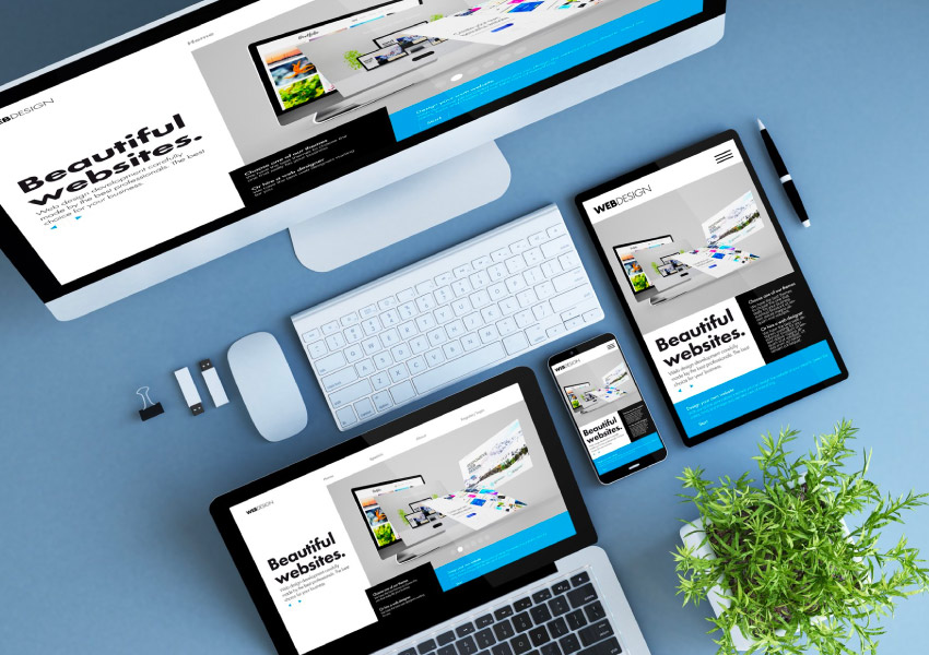
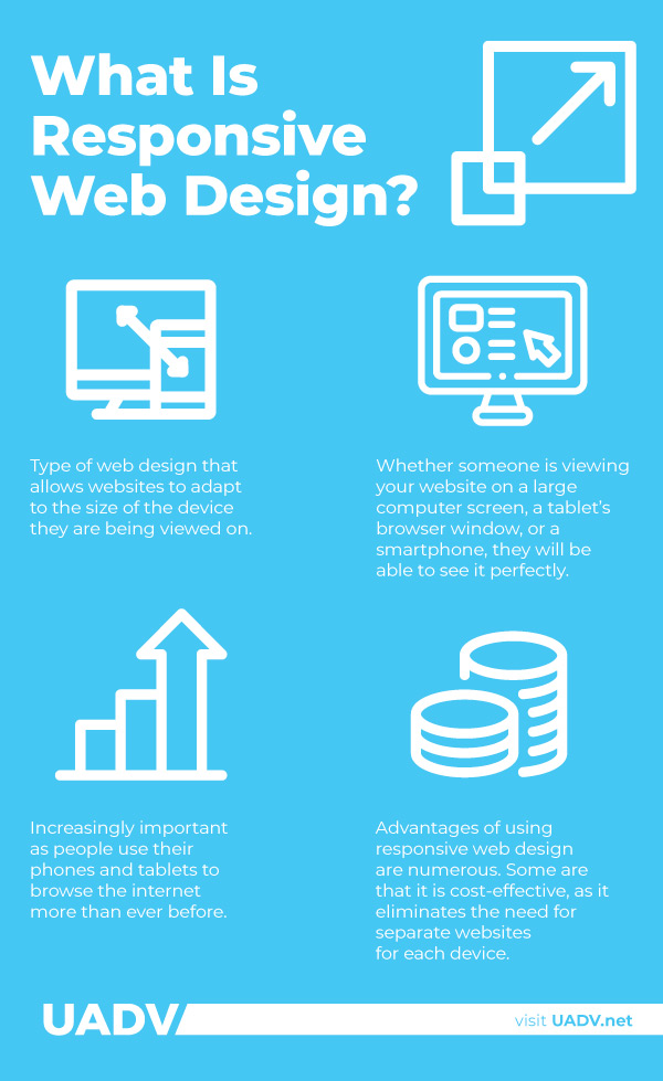
Responsive web design is a type of web design that allows websites to adapt to the size of the device they are being viewed on. This means that whether someone is viewing your website on a large computer screen, a tablet’s browser window, or a smartphone, they will be able to see it perfectly. In other words, your website will look good no matter what device it is being viewed on. This is becoming increasingly important as people use their phones and tablets to browse the internet more than ever before.
Responsive web design is achieved using responsive grids, media queries, and fluid images. A responsive grid is a system of columns and rows used to create different layouts for different devices. Media queries are used to adjust the layout of the website depending on the size of the device it is being viewed on. Fluid images are resized to fit the width of the device they are being viewed on, ensuring that all images look good no matter their size.
For example, if someone views your website on a mobile device, the layout will be different than viewing it on a desktop computer. This is because your site automatically adjusts to fit the device it is being viewed on.
The advantages of using responsive web design are numerous. Some are that it is cost-effective, as it eliminates the need for separate websites for each device; it helps with search engine optimization (SEO); and provides a better user experience as people can access your website from any device.

When it comes to responsive web design, there are a few key things you should consider.
To create a responsive website, you must follow certain design principles. These principles will help ensure that your website is responsive and looks good on any device. These design principles include:
Responsive grids are the basis for responsive web design. They allow you to create different layouts for different devices, ensuring that your website looks good no matter what device it is being viewed on.
Media queries are used to adjust the layout of the website depending on the size of the device it is being viewed on. This ensures that your website looks good no matter what size device it is being viewed on.
Images should be responsive so that they look good on any device. Fluid images are resized to fit the width of the device they are being viewed on, ensuring that all images look good no matter their size.
A responsive navigation menu should be designed to be easily used on any device. This means creating a menu that is easy to read and intuitive for users to navigate.
It is important to design with mobile first in mind as it ensures that your website looks good on any device. This means ensuring that the layout of your website works on mobile devices and then adjusting it for larger devices.
Once you have created your responsive website, it is important to test it on various devices to ensure it looks and works as intended.
Responsive frameworks provide pre-made responsive grids and media queries that make responsive web design easier. This tool is especially helpful for those who are new to responsive web design.
CSS3 media queries allow you to adjust the layout of your website depending on the size of the device it is being viewed on. This ensures that your website looks good no matter what size device it is being viewed on.
Flexbox and grid layouts are responsive design tools that allow you to create responsive grids and design responsive layouts. This ensures that your website looks good no matter what size device it is being viewed on.
HTML5 responsive web design techniques allow you to create responsive websites optimized for mobile devices. This ensures that your website looks good no matter what device it is being viewed on.
JavaScript libraries such as jQuery Mobile allow you to create responsive websites optimized for mobile devices. This tool is especially helpful for those new to responsive web design.
Testing tools such as Adobe Edge Inspect allow you to test your responsive website on various devices to ensure that it looks and works as intended. This is an important step in the responsive web design process, as it allows you to ensure that your website looks good on all devices.
There are some key best practices you should keep in mind when designing a responsive website.
Crafting a responsive design UX can be difficult since users interact with desktop websites through clicks and mobile versions through taps or swipes. There are tangible distinctions as well - for instance, desktops sit on surfaces while people typically hold their devices in their hands. These disparities drastically influence the way mobile UI designers fashion tap targets and other pertinent UI elements that individuals use to engage with.
A fundamental part of designing a great responsive website is taking advantage of the hardware features available on mobile devices. This can range from incorporating voice commands to using the device’s camera. There are also many UI patterns that take advantage of native gestures, like swiping and scrolling, to give users a better experience.
Having a website that is accessible to all users, including those with disabilities, is an essential part of any web development project. Responsive design presents unique challenges when it comes to ensuring a site is fully accessible. For example, designers must consider how their layout and navigation will work on different devices, both in terms of size differences and the lack of a mouse or keyboard.
Several key features in responsive mobile design help it stand out from traditional web design. These features include:
Responsive web design uses flexible grids that automatically adjust to the device's size. This ensures that your website looks good no matter what device it is being viewed on. This feature is important because it allows your website to cater to different screen sizes and resolutions.
Responsive web design uses a responsive font system that automatically adjusts text size depending on the device being used. By using responsive font sizes, the text will automatically adjust to the device's size, ensuring that it is always legible and easy to read.
This ensures that users have a great experience viewing the website on any device. Additionally, responsive font sizes can also be used to create a more aesthetically pleasing design, allowing for responsive layouts that look great no matter what size device is used.
Responsive web design also uses responsive elements such as buttons, menus, and navigation that are designed to be responsive and touch-friendly. This ensures that users have a great experience when interacting with your website on any device, including mobile devices.
Responsive web design is designed to be simple and provide a great user experience. This means that the layout should be easy to navigate, with each element clearly labeled and placed in an intuitive way. Additionally, responsive web design should also be responsive to different screen sizes, ensuring that users have the same experience no matter what device they are using to view your website.
Responsive web design has several key benefits, making it one of the most popular web design techniques today. These include:
Responsive web design ensures that users have a great experience viewing the website on any device, regardless of size or resolution. This guarantees that all website guests, regardless of the device they use, will have an outstanding experience.
Responsive web design is designed to be accessible for all users, regardless of disability or impairment. This ensures that all website visitors can easily access and use the website.
Responsive web design also helps improve search engine optimization by ensuring that the website can be easily indexed by search engines, making it easier for people to find it. Additionally, responsive web design helps improve the website’s ranking on search engines, as responsive websites are optimized for mobile devices.
Responsive web design is cost-effective as you don't need to maintain multiple websites for different devices or resolutions; instead, you can use a single responsive website that works on all devices and resolutions.
There are several examples of responsive web design that you can use as inspiration for your own website. Some of the most popular responsive websites include:

No Kids Allowed Cannabis Store is an example of a great responsive website design. The store has clearly taken into consideration the different types of devices users will be accessing the site from, including desktops, tablets and mobile phones. Furthermore, they have used large fonts and images to help facilitate a good user experience on any screen size.
Asides from this, they've used complimentary colors such as orange, purple, and green to create a visually pleasing experience, with a dark background that's gentle on the eyes and also that makes their content stand out.
Music is a great way to relax, but streaming music through your desktop or laptop can be a hassle. Spotify has designed their website with this in mind and developed an excellent responsive web design. The user interface is simple yet effective, featuring a vibrant color scheme that perfectly complements the music streaming experience.
The website also adjusts the layout depending on which device is being used, ensuring a seamless experience for users. They have also utilized several native mobile features to allow users to quickly and easily navigate the website.

CBD is becoming a popular alternative to traditional treatments, so it’s no wonder that there are lots of websites popping up selling products related to this. Serene Sensei is one such website and has been developed with a great responsive design.
The website features plenty of white space, which helps users focus on the content without getting overwhelmed. The layout also changes when viewed on different devices, taking advantage of the screen sizes available.
The use of SVGs also helps to create a visually appealing experience while also decreasing the website's overall load time.

At UADV, our responsive web design services focus on delivering websites that are designed to work on any device or resolution. Our team has years of experience in creating responsive websites and can help you create a website for your business that is tailored to your specific needs.
We use best practices for responsive web design, such as responsive typography, responsive elements, simplified navigation, and more. We also ensure that our websites are accessible to all users and are optimized for marketing.
If you’re looking for a reliable web design services provider to help create a responsive website for your business, contact UADV today!
.webp)
Our team will compare you to your biggest competitors in your industry across multiple points from SEO to social media so you can find strengths & weaknesses in your business.


